Showing posts with label themes. Show all posts

Monday, December 29, 2008

New Winter Theme

I left the Christmas theme up too long. My sugar high went kaput.

I thought I'd try a little textured white this time. Hopefully it doesn't remind those of you in the north too much how cold it is outside!


I also made changes to the comment section. I've embedded it inside the posts rather than the pop-up that I had before. Design-wise I love it. Functionally, the first time I tried it, I had difficulties. Hopefully that doesn't happen to any of you.

However if it does, email me at hannanfanATgmailDOTcom and let me know and I'll go back to the way it was.

The trick for me was to type my comment. Copy it onto a text document in case blogger loses it. Select google/blogger and hit preview. It would take me somewhere to sign in and then back to the preview of the comment. Then I click post comment if the comment was still there, and has worked since then.

Saturday, December 20, 2008

Just in time for Winter Solstice

I completed my Christmas theme for 2008.


It turned out way too girly, but I admit it's cute and I'm on a major sugar high that will probably last until a few days after Christmas, so it's not bugging me.

Sorry if it is too much for some... it won't last long, lol!

Monday, November 03, 2008

Fall is finally here!

In addition to the new blog look... I've also got some fall color pics to show off. There's nothing here compared to other parts of the country, but there are some hidden gems here and there.

This is from Vasona Lake County Park which is one of the most popular spots around. We live a little over a mile from it and the walk around the lake is at least 1 mile from the dam to about 90% around it where the path stops. Where the path stops is a neat little area I only discovered last March. There I had seen Black-crowned Night Herons before knowing what they were. I liked their little "pony-tail", lol! They were flying from that area to the "island" which doesn't hold much more than a couple of trees and miscellaneous bushes.

While at church yesterday, a member who is a jogger/birder mentioned to my mom that there was a mute swan hanging about. We didn't see it. But we saw some great fall colors from that side of the lake and on the way a couple of surprise birds which I'll post very soon. I think one of them will be my entry for Bird Photography Weekly #10.


So anyway, about this design...

I had some difficulty getting started on this one. I hadn't seen any backgrounds or other images that just screamed "THAT'S IT!" So I fooled around a bit on Paint Shop Pro with the tubs and such, but didn't quite have any ideas so I deleted what I was messing around with. Then I googled "fall colors paint shop pro" and clicked on images. In the images I saw something intriguing and it turned out it was a scrapbook place. I know others have picked out a design based on scrapbooking ideas, so I browsed around there a bit. They (don't remember who now) had a collage of their various fall line papers and it looked to me kinda like a patchwork quilt. That sparked an idea. So I went back into Paint Shop Pro and started on the background.

I picked a nice muted deep red as the original background and then applied a grid over it. Then in each grid I started "stamping" the various fall "tubes" I had. There was a sunflower that looked awesome and I then picked the rest of the colors out of that plus a contrasting muted green and made a 4x4 grid of fall colors. I had my background, and four panels covered, so then I kept playing around until I found 3 other designs going with the other three background colors. Then messed around a bit until it looked quilt-ish.

Then I worked on the basic colors of the blog and tried the dashed border and thought, yeah, that's perfect to give the idea of stitching. Then I tried a similar idea on the border. The green on the bottom was kind of a happy accident since I was just trying to get the text to align with the curve it left. Then somehow I thought that it would be cool to keep that in and dress it up as if it was planned. I gave the three different colors different cloth-like textures and had the lettering, the shape and the border all outlined in the dashes using vector shapes and the lettering tools. It doesn't seem to really be visible, but I also added texture to the dashes so it would look like 3D thread. Eh... the overall design gives the idea I'm pretty sure. If not... c'est la vie.

Then the rest of it, the siggy, the nuts-line and the leaf-line were all just gravy.

In addition... I discovered a new blogger feature. You can embed a comment box now so if you click on an individual post, you won't have to open up either a pop-up or a new page to make a comment. And I'm crossing my fingers once again that the backlinks will work. I do not know why they don't here and it's driving me insane. Blogger says that issues is fixed... well, Blogger, it's not! It doesn't even work for me if I have a plain pre-fab layout and background. My theory is that I'm stuck on beta blogger and can't get onto the regular blogger, but I can't find a solution for that either. I don't really feel like deleting this blog and starting anew either. So I just live with that.

ARGH... turns out another blogger "beta" issue. THe embed comments did not work on my blog... it did on my testing blog, but not here. Blech!

Anyway, hope you all enjoy!

Saturday, November 01, 2008

In case you missed it...

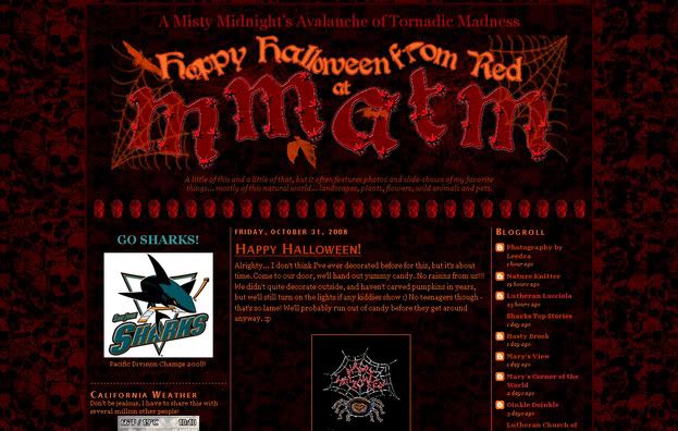
I decorated for Halloween :)


I'm now working on a fall theme, but for now I'm back to the Summer Picnic many of you are familiar with. If you missed the halloween one, I'll probably be reusing it year after year. Maybe with some adjustments here and there because I'm certain I left a few things undecorated since I didn't put enough time into it.

Meanwhile, have a gander at our fall in California :) Things turn brown and other flowers start to bloom rather than incredibly colored leaves. It's still pretty and what I consider "golden california".

Wednesday, September 10, 2008

well... i did it

It's pretty much done. As always, I'll discover a few things that bug me and I'll need to fix it. Right now I've got one where the header comes up with the background right away and there's a delay with the rest of the background below. I don't understand that. I hope it doesn't bug you all too much!

I divided this board up into 3 columns now, so hopefully all who visit here have a screen that is at least 1024x768. According to my sitemeter, that's pretty much the case. ALso, if I haven't posted in a while, you can always entertain yourself by clicking on one of the items in my sidebars... like the PacMan widget I discovered! I think even the patterns of the ghosties are about what I remember from the arcade game :D Way cool! Ooo, I should check and see if they have Centipede!

Enjoy yourselves and if you find a glitch, let me know and hopefully I can fix it!

UPDATE: Found Centipede! It seems it only works in IE for now. It needs Macromedia Flash and I would have thought Firefox had that, but I've been having issues with that browser since they upgraded to 3.0. Ugh. There are two more Centipede widgets, but they seem kinda buggy, no pun intended!

Monday, September 08, 2008

better wear a hardhat!


I'm going to be playing with the decoration of my blog again. Seasons change.
Oddly enough, what I had intended was a quasi-fall scheme, but what's turning out is a picnic-y theme. I don't know why bright colors insist on coming out of me!

Here's a preview:

Photobucket
I'm calling this one Summer Picnic

This might be a short lived theme as I do want a more subtle fall theme.

Wednesday, January 23, 2008

New design

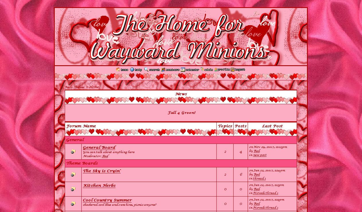
Well, I'm not a huge fan of Valentines day, but in a sugar-induced inspiration, I created a new skin for a proboards message board.

If you like pink, then this will truly appeal to you. So far I've been staring at it for a few days and I'm not nauseous yet, and I'm not really a pink kinda girl.

Monday, August 20, 2007

Design process for psychedelic

This was a fun theme to do. I was planning on doing something more 60s style and in a way it is. It's psychedelic, but I wasn't planning on going that direction. I was thinking just something like big repeating patterns in earthy tones. I was close... got the repeating patterns down, and somewhat earthy, but bright still. I just can't help it. Strange, huh?

I started out googling 60s style but didn't come up with much other than fashion. The I googled 60s music thinking album art or something would inspire me. I found a site called Crazyfads.com That had "rickie tickie stickers on it and that sparked something, so i googled that. Found the creator of that here. That was interesting.

Then I simply googled 60s in the images search and came up with a bunch of images, but nothing concrete. Then i thought "flower power". Now that showed cool results. That took me to this blog. I perused her blog a bit and found the images came from a a couple of different sites. One was a retro fabric site called Purl Soho. Great stuff there! If I sewed or was crafty at all I'd so buy stuff there. Likewise with stuff from Repro Depot. I bookmarked those sites to go back to later. When I did, I downloaded a bunch of the images to pull colors off of and be inspired by without being online.

Next I searched for retro wallpaper in the images search and found a site called Wallpaper from the 70s where I found this. This is one of several I downloaded and What I created is almost a blatant copy. The colors are the same for sure and through paint shop pro I created stripes and then made them wavy using a basic filter. Then I created a tile out of it so I could make a background out of it.

This image is that product:

I set it up in testing on Red's Themes and decided it needed a little more playing with. So I made a gradient out of the stripe (before the wave) and played with more filters. These images are the result of that:

Friday, August 17, 2007

New Look for MMATM

As you can see if you have visited me before.

What's cool is if you use the scroll wheel on your mouse or if you use the up and down keys on your keyboard, it'll really look psychedelic. I don't recommend doing that too much though or your eyes will hurt, lol.

I plan to make a cool title image for the blog - something along the lines of this:


This leaf was really fun to make and used up a whole lot of techniques... i'll blog about it when I create the one for MMATM here.

Sunday, August 05, 2007

Mary's Corner of the World: Announcement

Mary's Corner of the World: Announcement Yep, a new design. Thanks for the compliments :) Luckily it turned out somewhat what I envisioned. And I *AM* a graphic designer, I just don't wish to get paid for it.

I had mentioned to Mom a few weeks ago how she needed a one of a kind look. Like most newbies, she used a stock template, and then using the somewhat new blog customizing tools adjusted the colors on her blog. It looked fine, but it was still just a minima template.
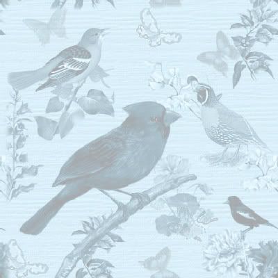
Then one day last week I all of a sudden got a vision in my head of various birds scattered over the background and then a layer put over it to make it monotone in a teal-ish sort of color. As I started my design, I thought, "hey flowers would go perfectly" and "hmmm... isn't there a magazine called "birds and blooms"? So in one fell swoop I got the title for the theme and a more complete background. I then added a bit of woodgrain texture over it just to give it a little more originality - and well, I just love textures.

I had also envisioned a wrapper that was sheer, lightening the background where the text boxes were to be. After all, the point of a blog is writing and reading, so that for sure had to be quite legible. I played with a couple of images that were sheer in Paint Shop Pro, but when uploaded to photobucket were no longer sheer. I swear, I've done it before, but can't remember now. Oh well.

So what I did to work around that issue was to take the background and put a sheer layer over it and have the bg show through ever so slightly. That seemed to work but it took me a couple hours to figure out how to align the wrapper with the background so that it appeared to be a sheer layer over the bg. I think it may be a pixel or two off, but since it's so light - and I put a border on the wrapper, it's hard to know for sure.

I then showed Mom the rough draft, and mentioned (as above) I was having a hard time finding the right text colors that would show over the design. She suggested it was too dark, so I lightened it up, and it was a lot better. You can't see the birds as clearly now, but the blog itself is the true focus.

Then for her logo / title bar, I knew she needed a full color bird and I happened to pick an oriole. 2 reasons... one, she's from Baltimore and two, it was a really cute free image (hope so anyway, you never know anymore) I spotted on a free PSP tubes site. This helped me flesh out her title in that orange color and then get the title bars on the blogs in orange too. That gave me a second color (not counting white) to make it more complete. I know, I know, three is the magic number, but if I must, then I pick white to be my third color :p

Wednesday, August 01, 2007

Templates, Skins, Themes, etc. available for you!

Check Red's Themes out for skin ideas for your blog, webpage, message board, whatever. Click on any or all of the forums listed under Themes for a preview of what it would look like on Yuku. Just a little tweaking can make it your blog too.

I still need to complete some of the themes with buttons and whatnot, but you can get the idea.

Tuesday, July 24, 2007

Red's Themes

Red's Themes
My Yuku site has been updated. I suppose it's about time.

And with this post, lol, my blog has been updated too.
 

Current skin is Spring Green 2009
Best viewed on Firefox at 1024x768, larger or widescreen.
If you must use Internet Explorer, update to IE8 or the sidebars will look funky.