Mary's Corner of the World: Announcement Yep, a new design. Thanks for the compliments :) Luckily it turned out somewhat what I envisioned. And I *AM* a graphic designer, I just don't wish to get paid for it.
I had mentioned to Mom a few weeks ago how she needed a one of a kind look. Like most newbies, she used a stock template, and then using the somewhat new blog customizing tools adjusted the colors on her blog. It looked fine, but it was still just a minima template.

 Then one day last week I all of a sudden got a vision in my head of various birds scattered over the background and then a layer put over it to make it monotone in a teal-ish sort of color. As I started my design, I thought, "hey flowers would go perfectly" and "hmmm... isn't there a magazine called "birds and blooms"? So in one fell swoop I got the title for the theme and a more complete background. I then added a bit of woodgrain texture over it just to give it a little more originality - and well, I just love textures.

 Then one day last week I all of a sudden got a vision in my head of various birds scattered over the background and then a layer put over it to make it monotone in a teal-ish sort of color. As I started my design, I thought, "hey flowers would go perfectly" and "hmmm... isn't there a magazine called "birds and blooms"? So in one fell swoop I got the title for the theme and a more complete background. I then added a bit of woodgrain texture over it just to give it a little more originality - and well, I just love textures.
I had also envisioned a wrapper that was sheer, lightening the background where the text boxes were to be. After all, the point of a blog is writing and reading, so that for sure had to be quite legible. I played with a couple of images that were sheer in Paint Shop Pro, but when uploaded to photobucket were no longer sheer. I swear, I've done it before, but can't remember now. Oh well.
So what I did to work around that issue was to take the background and put a sheer layer over it and have the bg show through ever so slightly. That seemed to work but it took me a couple hours to figure out how to align the wrapper with the background so that it appeared to be a sheer layer over the bg. I think it may be a pixel or two off, but since it's so light - and I put a border on the wrapper, it's hard to know for sure.
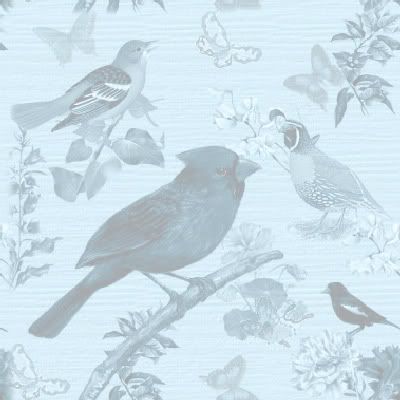
 I then showed Mom the rough draft, and mentioned (as above) I was having a hard time finding the right text colors that would show over the design. She suggested it was too dark, so I lightened it up, and it was a lot better. You can't see the birds as clearly now, but the blog itself is the true focus.
Then for her logo / title bar, I knew she needed a full color bird and I happened to pick an oriole. 2 reasons... one, she's from Baltimore and two, it was a really cute free image (hope so anyway, you never know anymore) I spotted on a free PSP tubes site. This helped me flesh out her title in that orange color and then get the title bars on the blogs in orange too. That gave me a second color (not counting white) to make it more complete. I know, I know, three is the magic number, but if I must, then I pick white to be my third color :p


 Posts
Posts