This was a fun theme to do. I was planning on doing something more 60s style and in a way it is. It's psychedelic, but I wasn't planning on going that direction. I was thinking just something like big repeating patterns in earthy tones. I was close... got the repeating patterns down, and somewhat earthy, but bright still. I just can't help it. Strange, huh?
I started out googling 60s style but didn't come up with much other than fashion. The I googled 60s music thinking album art or something would inspire me. I found a site called Crazyfads.com That had "rickie tickie stickers on it and that sparked something, so i googled that. Found the creator of that here. That was interesting.
Then I simply googled 60s in the images search and came up with a bunch of images, but nothing concrete. Then i thought "flower power". Now that showed cool results. That took me to this blog. I perused her blog a bit and found the images came from a a couple of different sites. One was a retro fabric site called Purl Soho. Great stuff there! If I sewed or was crafty at all I'd so buy stuff there. Likewise with stuff from Repro Depot. I bookmarked those sites to go back to later. When I did, I downloaded a bunch of the images to pull colors off of and be inspired by without being online.
Next I searched for retro wallpaper in the images search and found a site called Wallpaper from the 70s where I found this. This is one of several I downloaded and What I created is almost a blatant copy. The colors are the same for sure and through paint shop pro I created stripes and then made them wavy using a basic filter. Then I created a tile out of it so I could make a background out of it.
This image is that product: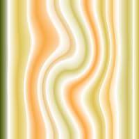
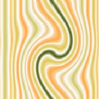
I set it up in testing on Red's Themes and decided it needed a little more playing with. So I made a gradient out of the stripe (before the wave) and played with more filters. These images are the result of that:



I started out googling 60s style but didn't come up with much other than fashion. The I googled 60s music thinking album art or something would inspire me. I found a site called Crazyfads.com That had "rickie tickie stickers on it and that sparked something, so i googled that. Found the creator of that here. That was interesting.
Then I simply googled 60s in the images search and came up with a bunch of images, but nothing concrete. Then i thought "flower power". Now that showed cool results. That took me to this blog. I perused her blog a bit and found the images came from a a couple of different sites. One was a retro fabric site called Purl Soho. Great stuff there! If I sewed or was crafty at all I'd so buy stuff there. Likewise with stuff from Repro Depot. I bookmarked those sites to go back to later. When I did, I downloaded a bunch of the images to pull colors off of and be inspired by without being online.
Next I searched for retro wallpaper in the images search and found a site called Wallpaper from the 70s where I found this. This is one of several I downloaded and What I created is almost a blatant copy. The colors are the same for sure and through paint shop pro I created stripes and then made them wavy using a basic filter. Then I created a tile out of it so I could make a background out of it.
This image is that product:

I set it up in testing on Red's Themes and decided it needed a little more playing with. So I made a gradient out of the stripe (before the wave) and played with more filters. These images are the result of that:



4 comments:
WOW!! Quite involved - but it looks like fun - I'm sure this took several hours to do.
yes and no ;)
the searching and thinking took about 2 days... the images shown in this post took only about 1/2 an hour of doing, undoing, etc until i liked them... putting the message board format together about 2 hours I think... putting the blog format together also about 2 hours... that was more difficult because it's such a different system.
What took the most amount of time were the banners which I plan to blog about next before I forget how I made them.
Wow! This is really cool. Great job!
Thank you Carrot... and welcome back!
Unfortunately, I'm leaving on vacation tomorrow. I hope to get a chance to blog about the banners before I go, if not... maybe I can compose it and even post it in the airport.
Post a Comment