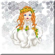
I thought I'd try a little textured white this time. Hopefully it doesn't remind those of you in the north too much how cold it is outside!

I also made changes to the comment section. I've embedded it inside the posts rather than the pop-up that I had before. Design-wise I love it. Functionally, the first time I tried it, I had difficulties. Hopefully that doesn't happen to any of you.
However if it does, email me at hannanfanATgmailDOTcom and let me know and I'll go back to the way it was.
The trick for me was to type my comment. Copy it onto a text document in case blogger loses it. Select google/blogger and hit preview. It would take me somewhere to sign in and then back to the preview of the comment. Then I click post comment if the comment was still there, and has worked since then.


5 comments:
I LOVE your new layout!!
It's frosty and clean.
Actually, the whitish background seems to give a calming effect. Nice design as usual, Red.
Thank you both :) Good thing too because it might last until spring.
I like the background and the New Look. It does look like frost on a window, and at the same time I can also see bird feathers. I guess I have a bird brain or rather birds on my mind. :)
Happy New Year
Thanks Bernie!
Now that you mention it... it does look like bird feathers. I can attest that you most certainly do not have a bird brain, but technically it's a pine or spruce type of texture. At least that's what it was like in color.
Happy New Year to you and yours!
Post a Comment